Designer
Stan Walsh
Year
1966
Client
Orioles Team
The Baltimore Orioles were originally known as the St. Louis Browns. Their logo, established in 1902, consisted of “ST.L” text. This logo was modified over the next several years before it was dropped after the Browns moved to Baltimore and changed their name to the Orioles.
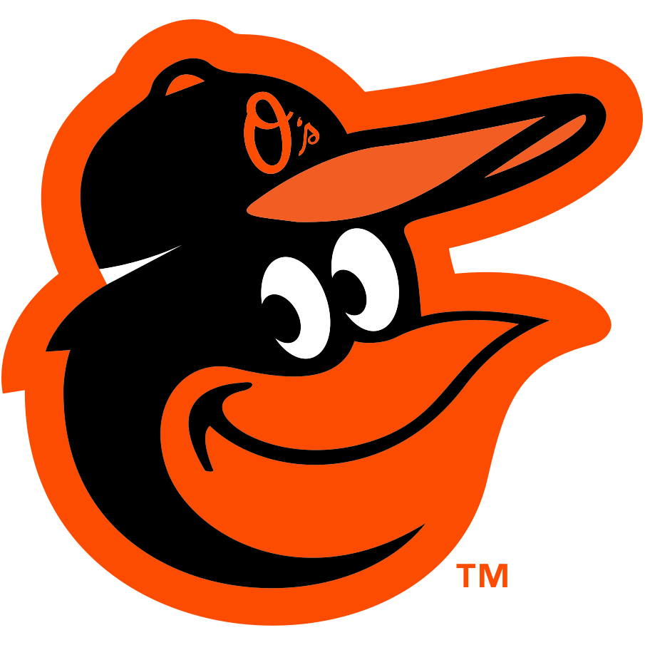
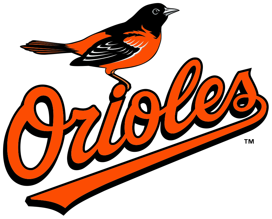
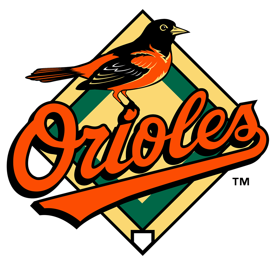
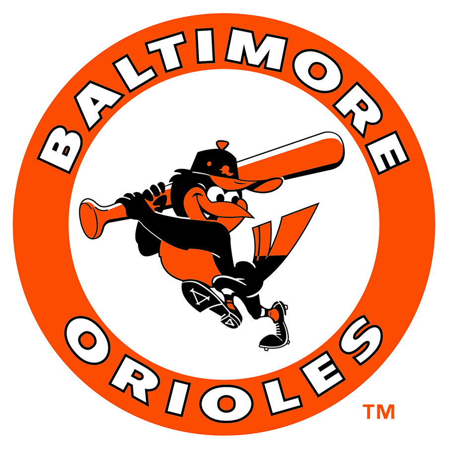
Upon changing their names to the Orioles, the logo was likewise changed. The new logo was an oriole colored black, orange, and white, perched on top of a baseball with two crossed baseball bats behind it. This logo was used for nine years. In 1966, the logo was redesigned thanks to the help of Stan Walsh. The new logo kept the black, orange, and white oriole from the previous logo, but it was now swinging a baseball bat. This logo was kept all the way until 1992, where the logo became a large, orange “Orioles” script with a black, orange, and white oriole perched on top of it, with the word “Baltimore written inside the tail of the “Orioles” text. This logo was expanded upon in 1995, which saw the logo being plastered in front of a baseball diamond, with the oriole now facing the opposite direction. This new logo was slightly modified over the next few years before the baseball diamond was removed in 2009. Finally, in 2019, the logo was changed to what it is today: a cartoonish black, orange, and white oriole head with an Orioles cap on its head.
This logo deserves to be part of the Baltimore graphic design history canon for multiple reasons. All of the logos have used black, orange, and white as their colors, demonstrating an incredible consistency given how long the team has been around. The constantly changing logos represent the constant change in the team’s philosophy and attitude—while past logos depicted a realistic-looking oriole, the current logo features a cartoonish, anthropomorphic oriole, making the logo more appealing to younger audiences. The Orioles have been cemented in Baltimore’s history as an icon of the city, as well as an icon of baseball. The logos have been featured on several pieces of merchandise, like t-shirts, baseball caps, and more. The Orioles logo is one of the most recognizable icons of Baltimore, more than deserving of being considered part of the city’s graphic design history.
Source
Parker, G. (2019, February 23). The History of The Baltimore Orioles Logo. Money Inc. https://moneyinc.com/baltimore-orioles-logo/
Baltimore Orioles Logo, symbol, meaning, history, PNG, brand. (n.d.). Retrieved November 7, 2023, from https://logos-world.net/baltimore-orioles-logo/
Baltimore Orioles Primary Logo – American League (AL) – Chris Creamer’s Sports Logos Page – SportsLogos.net. (n.d.). Www.sportslogos.net. Retrieved November 7, 2023, from https://www.sportslogos.net/logos/view/5258002019/Baltimore_Orioles/2019/Primary_Logo


