A regression can be seen as a kind of extension of a correlation. When doing a regression, you find a lot of the same outputs, like Pearson’s r and r-squared. The difference is that the point of a regression is to also construct a model (usually linear) that will help us predict values using a line of best fit. In the case of this example, we will be looking at average hours of sleep students get and comparing it to their GPA. A regression will also give us a model (y=mx+b) that would allow us to predict the GPA of a hypothetical student if we knew the average amount of sleep they get a night.
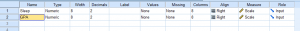
First, we need to create our variables in Variable View.
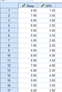
Then, we need to input our data into Data View. You can’t see it in this photo, but I have 25 participants total.
To start our regression, we need to go to Analyze > Regression > Linear.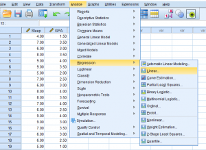
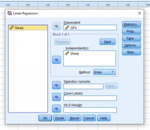
Once we click that, this pop-up will appear. Make sure to make your predictor the independent variable and the predicted variable the dependent variable.
It may be important for you to then click the Statistics button and make sure to check what you need to include in your report. Descriptives and Confidence Intervals never hurt.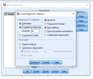
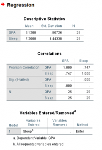
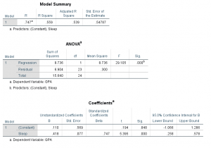
Your output will look something like the following two pictures. Descriptives are at the top, so this will help you report your means and standard deviations if you need to. Next are your correlation matrices. In my case, it looks like Sleep and GPA have a somewhat strong positive correlation and it appears to be significant with a p- value of less than .001. Ignoring the variables entered/removed section, the model summary shows us once again our r value and it also gives us an r-squared value. The ANOVA table gives us an F value and significance if we choose to report that. Finally (and the part we’ve been waiting for) is the model. This part is like in Algebra when you needed to learn about linear functions. We’re constructing a line using y=mx+b where the m is the slope and the b is the y-intercept. For this example, the model we’re working with is y=0.11x+.418 and I found these numbers from the coefficients table.
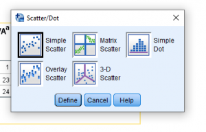
Now let’s say you need a graph of this. Go to Graphs > Legacy Dialogues > Scatter Plot…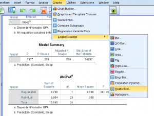
This pop-up should appear. Just click Simple Scatter.
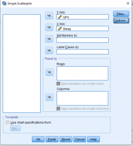
Another pop-up should appear. Make sure your predictor is on the x-axis and the predicted variable is in the y-axis.
You should end up with this basic scatterplot of your points.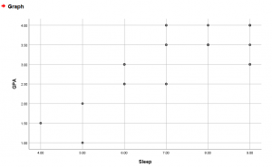
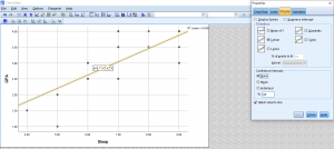
To get the line of best fit, right-click the graph > Edit Content > In Separate Window.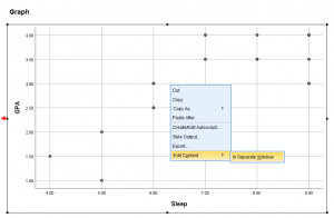
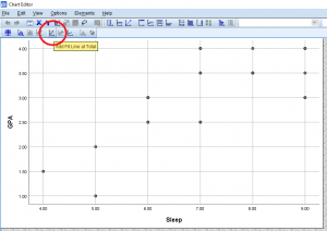
A new editing pop-up will appear. Click the linear equation button at the bottom of the bar. It will say Add Fit Line at Total when you hover over it.
Once that’s done, your graph should look something like this. If you exit out of the pop-up to go back to the output, the output graph should represent the changes you made in the editor pop-up.