At first, it seems like a simple question: What will the University of Baltimore’s library look like once the major renovation is complete? From the street and from other UB buildings, we’ve watched the construction for the past year. For anyone with that extra level of curiosity, illustrations of the interior space have been readily available. But the library isn’t just a cool, attractive place we’ll be passing through―it’s a home, a university square where students and faculty will work together. It’s designed to inspire both individual research and collaboration. But that raises the most important question: How will it do that?
‘A Harmonic Whole with All Essential Means’
 Behnisch Architekten, the firm behind the library renovation, describe their process as being contextual, tied to the specific demands of project and place. Not only that, they design their projects with the goal of creating familiar landmarks, “emblematic of the place and respecting the ‘genius loci’.” To be successful in these aims, Behnisch Architekten need to understand who they are working with, and where.
And when it comes to their work on this project―their second for UB; they designed the University’s John and Frances Angelos Law Center―it’s clear that they do. It couldn’t be more direct, in the words chosen by the firm to describe the library’s design as a “floating box housing all of the library’s treasures,” which mirrors language used by UB President Kurt L. Schmoke, who, in 2016, called the special collections at the library “one of the hidden treasures of the city.” That phrase, “floating box,” also mirrors language used by the Dutch artist Theo van Doesburg in his 1924 manifesto for De Stijl building design, “Toward a Plastic Architecture.”
Although the designers at Behnisch Architekten don’t claim to be disciples of Doesburg, many of the points made in his manifesto can be applied to this project. He describes the new architecture as having a sort of, “floating aspect which, so to speak, runs counter to the natural forces of gravity.” In the same way that the library’s interior layout uses color as a map to guide patrons to the services they require, Doesburg describes color as “not decorative or ornamental, but an organic element of architectural expression.”
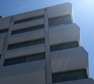
In the same way that the building’s glass hall pushes outward from the bright, white cube that has appeared on Maryland Avenue, Doesburg writes that the new architecture, “throws the functional space (as well as canopy planes, balcony volumes, etc.) out from the centre of the cube, so that height, width and depth plus time become a completely new plastic expression in open spaces.”
The goal of De Stijl architecture is to create a holistic building style, where beauty stems from functionality rather than existing as an addition to it. The objective is to create space that asks to be used in unpredictable ways―because spaces are used by people.
“The intention,” as Doesburg describes it, “is to create a harmonic whole with all essential means.”
Lucy Holman, director of the library, puts it like this: “Library as place.”
Behnisch Architekten may not have purposefully applied Doesburgs’ ideals of plastic architecture to the design of UB’s library, but plasticity is an excellent way to describe what this space may come to represent.
Plasticity of Space

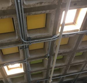
Ceiling vaults feature high-efficiency lighting and acoustic tiles
Open, clean, bright―a space that is modern, yet does not obscure the exposed conduit and ducts that remind us of the necessary work of the structure. Significant pieces of the old, pre-renovated library, such as the poured concrete vaults that make up the ceiling on each floor, are celebrated in interesting, colorful ways. Overall, in fact, not much that was original has been removed or hidden away―that is, except for the oppressive pebble-finish skin of the old building. Its original footprint and height have been preserved, except for the glass atrium on the back. The goal is to hold on to what was working in the library from the start, but to introduce the idea of not limiting what may come next in education, and how the library may adapt to that. In a word, the new facility is all about potential.
While all new spaces exude a sense of potential at first, there is eventually a period of settling which turns that potential into inflexibility. In a university setting, this can become a serious problem. Classes are not fixed from semester to semester, and faculty or even entire departments might move from space to space. It’s not rare to see a classroom with strange fixtures and sockets from years ago when it was a lab with a different purpose, or an office that has moved to new digs that don’t truly meet the needs of the inhabitants.
“When many people hear the word ‘library,’ they think ‘books,’” Holman says, “But we’re so much more than that.”
Consider a few of the hard-to-miss additions to the renovated facility, such as the glass-walled study and meeting spaces that pop up on various floors in a variety of sizes. Sure, you could settle in with a book in this closable “study pod” space. But you could also sit down with friends and classmates and discuss ideas for a group project. The building’s small- and large-group study rooms contain a variety of amenities, from AV equipment to bean-bag chairs.
Acoustic Complications
The role of sound in design isn’t something we typically consider as we move through or inhabit a space. In a library, however, it is an important consideration. Libraries need to be audibly muted—they are places of intense focus and study. But this is complicated by a library in an urban setting, a centrally-located facility serving as the intellectual heart of a work-oriented university.
Groups must be able to communicate as they collaborate. They need to be able to share ideas freely, but they can’t disturbing anyone else. Lecturers and performers making use of the event space, which will double as a quiet study room when not in use, have to be heard by their audiences. Simulation and Game Design students need to be able to interact with their sonically focused projects, while students making use of the writing center (which will share a floor with the game collection) can’t be distracted.

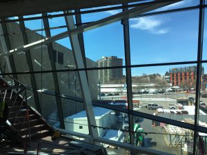
The atrium takes shape
The geometry and materials used in the construction of the building seem counterintuitive to these conflicting considerations. Concrete isn’t exactly known for its sound absorbing properties. Neither are the angles and glass panels that make up the atrium―an open space which reaches from the fourth floor all the way down to the first. By all rights, the library seems to have the makings of a noisy echo chamber.
To deal with these problems, an acoustical consultant was hired to study the unique properties of the building. Inter-space noise control features were implemented to prevent noise from traveling from space to space. For example, the second floor is mostly an open space for reading or studying, but three of the oval-shaped study rooms, or “beans,” which are enclosed in glass, also share the floor. To prevent conversation inside from leaking out, or even bouncing off the glass panels noisily within, each of the beans is equipped with lowered, sound-absorbing ceiling panels. The concrete waffle slabs, visible in the ceiling of the open spaces on each level, are fitted with specially designed sound-absorbing tiles, which match the color mapping of the floor and section where they are installed.
None of these features will likely be noticed by library patrons—they aren’t meant to be noticed. The only way you would notice something like acoustic engineering, inflexible design, or the functionality of space is if they were overlooked by designers in the first place. When these various design features are implemented properly―creating a space of seamless, catch-free use―patrons can focus on what they should be focusing on.
So, to answer the original question: How will the library work?
It will quietly, intentionally, and intuitively, interact with its users. Knowledge, cultivated by individuals or in groups, will be the result.
Libraries exude a sense of potential by nature. Students and community members use our facilities for work, study, relaxation, entertainment, and more. We asked our patrons how they use the library, so we could show how those services are only going to get better–read their responses here.
Kyle Fierstien is an undergraduate English major specializing in professional writing.