Tag Archives: graphs

Statistics: Reading Graphs for Two-Way ANOVAs

Reading graphs of two-way ANOVAs is often a little frustrating at first for students who are new to reading them. The goal of this post is to hopefully make the process more straight-forward.

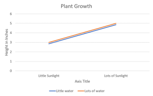
If you’re not sure already what a main effect or interaction is, I would suggest heading over to another post about two-way ANOVAs first. The purpose of one of these graphs is to help the reader visualize the results of the test when reading the results can sometimes be overwhelming, especially if the researchers are working with several different levels in each independent variable. The first trick to remember is that when looking for a significant main effect in the variable on the X-axis, we want the mean distance between the two points above one condition to be different from the mean distance between the two points of another condition. A clear example of this is below. The middle point between the orange line and blue line above “Little Sunlight” is around 2.8, while the middle point between the orange line and blue line above “Lots of Sunlight” is about 4.8. Given the context, we would say that there is a main effect for sunlight in which plant growth increases as levels of sunlight increase.

Continue reading

Statistics: Frequency Distributions

Frequency Distributions

In statistics, a lot of tests are run using many different points of data and it’s important to understand how those data are spread out and what their individual values are in comparison with other data points. A frequency distribution is just that – an outline of what the data look like as a unit. A frequency table is one way to go about this. It’s an organized tabulation showing the number of individuals located in each category on the scale of measurement. When used in a table, you are given each score from highest to lowest (X) and next to it the number of times that score appears in the data (f). A table in which one is able to read the scores that appear in a data set and how often those particular scores appear in the data set. Here’s a link to a Khan Academy video we found to be helpful in explaining this concept.

Organizing Data into a Frequency Distribution

  1. Find the range
  2. Order the table from highest score to lowest score, not skipping scores that might not have shown up in the data set.
  3. In the next column, document how many times this score shows up in the data set

Organizing data into a group frequency table

  1. The grouped frequency table should have about 10 intervals. A good strategy is to come up with some widths according to Guideline 2 and divide the total range of numbers by that width to see if there are close to 10 intervals.
  2. The width of the interval should be a relatively simple number (like 2, 5, or 10)
  3. The bottom score in each class interval should be a multiple of the width (0-9, 10-19, 20-19, etc.)
  4. All intervals should be the same width.

Continue reading