Reading graphs of two-way ANOVAs is often a little frustrating at first for students who are new to reading them. The goal of this post is to hopefully make the process more straight-forward.
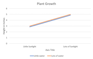
If you’re not sure already what a main effect or interaction is, I would suggest heading over to another post about two-way ANOVAs first. The purpose of one of these graphs is to help the reader visualize the results of the test when reading the results can sometimes be overwhelming, especially if the researchers are working with several different levels in each independent variable. The first trick to remember is that when looking for a significant main effect in the variable on the X-axis, we want the mean distance between the two points above one condition to be different from the mean distance between the two points of another condition. A clear example of this is below. The middle point between the orange line and blue line above “Little Sunlight” is around 2.8, while the middle point between the orange line and blue line above “Lots of Sunlight” is about 4.8. Given the context, we would say that there is a main effect for sunlight in which plant growth increases as levels of sunlight increase.
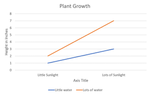
When determining if there is a main effect for the independent variable represented by the lines themselves, we’re simply looking at how far apart they are. In the example above, the lines are basically on top of one another, so we would say there is no main effect for water. However, in the example below, there is a wide gap between the orange line and the blue line. In this case, we would say that there is a main effect for water, in which plant growth increases as water increases. However, we would also say that there is no main effect for sunlight here, since the middle point between the blue and orange line stays the same.
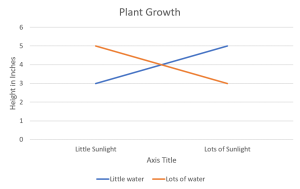
Finally, we need to talk about interactions. The more parallel the lines, the less likely there is to be an interaction. That being said, when the lines are looking like they are going to cross or are crossed outright, that’s a good indication that there is a significant interaction. In the example below, we can see that there is a crossing of the lines, so there is a significant interaction between sunlight and water. However, there are no main effects. There is no main effect for sunlight because the middle points between the orange and blue lines stay the same in both conditions. There is no main effect for water because there is no real distance anywhere between the lines. Another way to look at it is that the two ends of the orange line are not consistently above or below the two ends of the blue line.
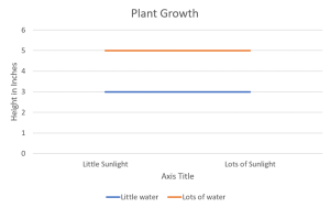
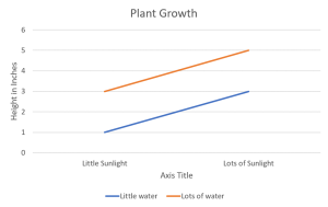
Let’s look at some other examples in which there is more than one significant outcome. Below is an example of a chart in which there are two main effects and no interaction. The middle points between the orange and blue line change depending on the condition, and there is a significant distance between the orange line and the blue line (or it could be said that the two endpoints of the orange line are consistently above the endpoints of the blue line).
This final example has a significant interaction and two significant main effects. The middle point between the orange and the blue line changes over the conditions, the distance between the two lines is considerable, and the lines are not exactly perpendicular; they look as though they may cross soon. This interaction is cutting it a bit close and it would be easier to see if there were three conditions to work with, but for the sake of simplicity, we’ll stick with two.